-
Type
Web application
-
Sectors
Health & wellness, lifestyle, personal development
-
Technologies
Javascript, PHP, CodeIgniter, MySQL, OpenAI, Vimeo
From Keynote
Stage to Digital
Platform
John Bielinski is a speaker and author whose message is simple and powerful: you only live once, so live your most cherished life. Through his book and keynote talks under the Yolo Sage brand, he has built a community of people committed to personal growth and intentional living. But a book has limits. Readers finish it, feel inspired, and then life takes over. John needed something that would keep people engaged long after the last page. A tool that could turn his philosophy into a structured, ongoing practice.
That's where Elemental came in. John approached us to design and build a web application that would sit alongside his book and live events, giving his readers and community a place to put his framework into action. This wasn't a marketing site or a content hub. It was a deeply interactive platform where users would set goals, track progress, and engage with AI-generated content tailored to their personal journey. The brief was clear: build something that feels personal, keeps people coming back week after week, and does justice to the emotional weight of the CHERISH framework.
The CHERISH acronym (Career, Health, Ego and Emotions, Relationships, Integrity, Spirituality, and Happiness) is the philosophical backbone of everything John teaches. Every feature in the app needed to map back to these seven pillars, from goal-setting and video content to AI-generated eulogies and mission statements. The platform had to feel like an extension of the book, not a bolted-on afterthought.
From the outset, we knew this project would require careful thought about user experience. The app asks people to reflect honestly on their lives, confront uncomfortable truths, and commit to a three-year personal development programme. That kind of emotional engagement demands a design and flow that feels supportive, intentional, and never overwhelming. Getting the onboarding journey right would make or break the entire platform.
We also recognised that the technical architecture needed to be as considered as the design. A 156-week structured programme with AI-generated content, weekly ranking windows, automated reminders, and a library of video content meant the back-end had to be robust, reliable, and built to handle complexity without exposing it to the user.
An Onboarding Experience That Sets the Tone
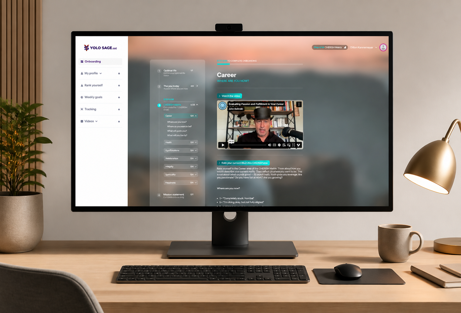
The onboarding journey is the emotional and functional heart of the application. We designed it as a guided, multi-step experience that eases users into the platform while collecting the deeply personal inputs that power the rest of their journey. Every step was deliberate. Users watch introductory videos, reflect on their current life, and build the foundations of their three-year programme before they ever reach the dashboard.
The process begins with a self-assessment. Users watch a video about living life to its highest capacity, then move into what is arguably the most powerful part of the platform: the eulogy exercise. Users provide bullet points describing both their current life and the life they aspire to. These inputs are then processed through an AI integration that transforms them into two fully written eulogies: one reflecting how their life reads today, and one capturing how they want to be remembered. The contrast between the two is intentionally striking, designed to create the motivational tension that drives the rest of the programme.
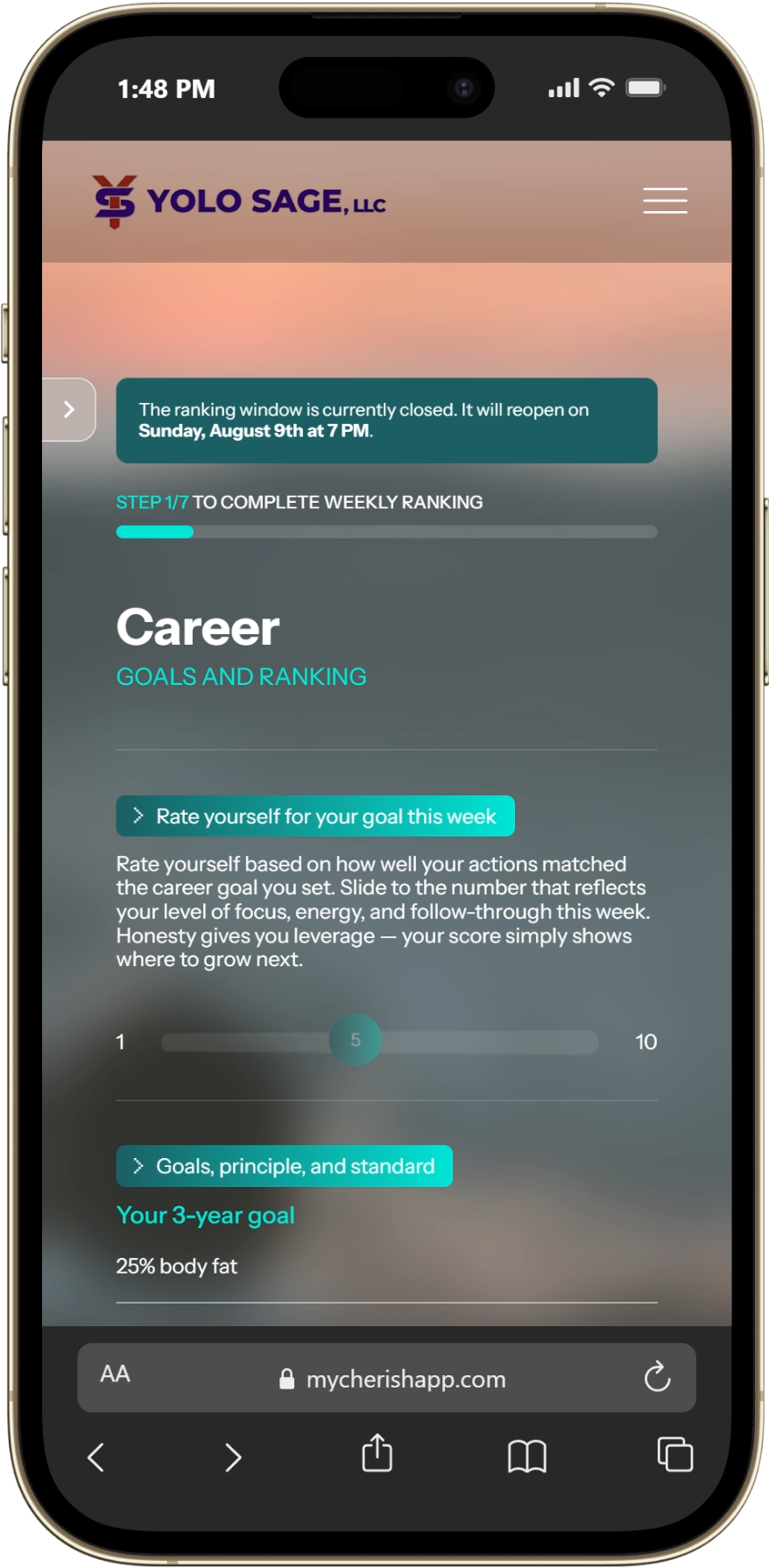
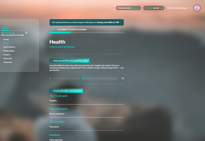
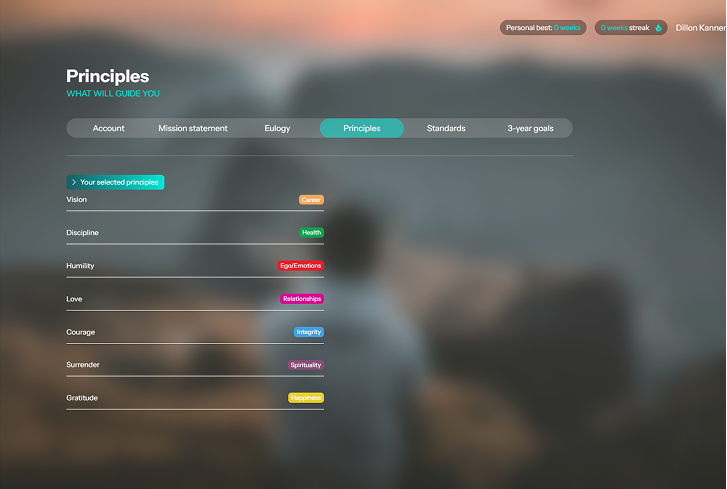
From there, users rate themselves across each of the seven CHERISH categories on a scale of one to ten, setting their three-year vision. They select guiding principles from a curated set of options, and the AI generates a personal mission statement drawn from those choices. Finally, users set the standards they want to live by, the commitments that will shape their weekly practice. Once all steps are complete, the data is locked in and the user's programme begins.
We built the onboarding to be resilient to real-life interruption. Auto-saving ensures users can close the browser mid-step, return days later, and pick up exactly where they left off. Behind the scenes, all onboarding data is held in a staging structure until every step is complete, then distributed to the correct parts of the system in a single operation. This prevents any half-finished data from leaking into the live experience and ensures that when a user lands on their dashboard for the first time, everything is complete and coherent.
The design of the onboarding was treated with the same care as any other user-facing feature. We worked through the flow in detail during our design sprints, ensuring that the transitions between steps felt natural, the video content was given space to breathe, and the moments where users are asked to reflect were visually calm and uncluttered. The goal was a process that felt like a guided conversation, not a form to be filled in.

Built for the Long Game
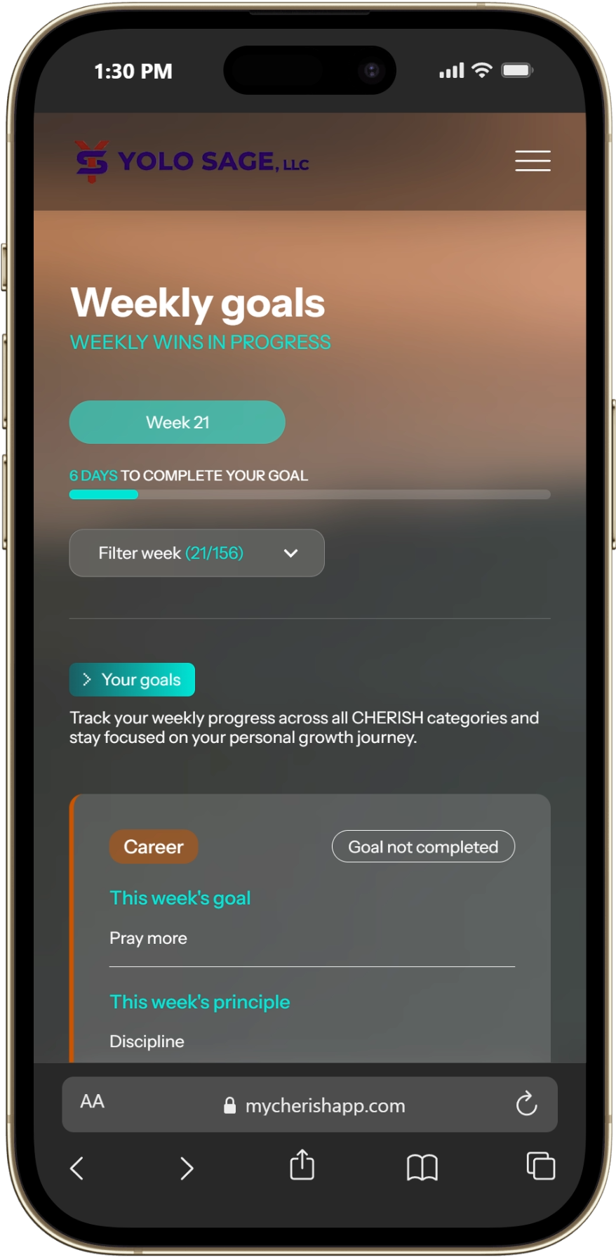
Where many apps focus on the first impression, My Cherish App was designed for sustained engagement over three years. The platform operates on a weekly rhythm: every Sunday, users return to rank themselves on their CHERISH points, review their goals, set new ones, and track their progress over time. This regular check-in is the engine of the entire experience, and building it required us to think carefully about habit formation, motivation, and the mechanics of long-term data tracking.
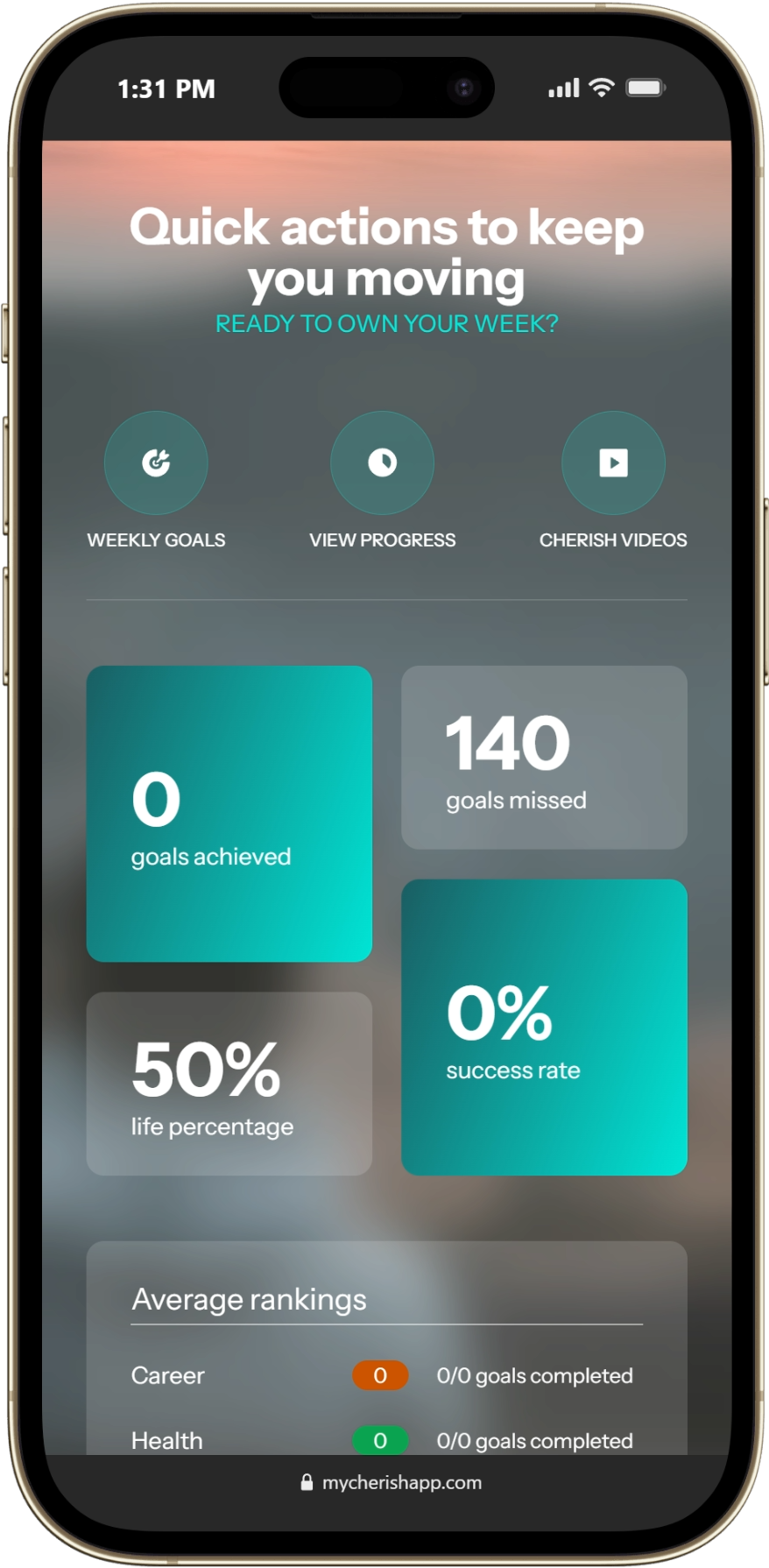
The dashboard gives users a high-level view of where they stand. Metrics, statuses, and calls to action surface the most important information without overwhelming the user. A tracking graph visualises progress over time, allowing users to compare their current rankings to where they started and where they want to be. The weekly ranking system feeds into this graph, creating a visual record of their journey across all seven CHERISH categories.
Goal-setting is woven into the weekly cycle. Users set new goals each week and review them on Sundays, ticking off what they've achieved. We introduced gamified animations to celebrate completed goals, small moments of reward that reinforce the habit loop and make the experience feel alive. Automated reminders prompt users to complete their rankings if they haven't done so, keeping engagement consistent without being intrusive.
Beyond the weekly rhythm, the platform offers several content sections that users can access at any time. Tactics provides a library of videos filtered by CHERISH category. Cheat Codes offers videos and downloadable resources. Momentum houses archived content organised by the seven pillars. Users can also revisit their mission statement, eulogies, principles, and standards at any point, serving as read-only reminders of the commitments they made during onboarding. These sections ensure the platform always has something to offer, whether a user has five minutes or an hour.
The administrative side of the platform was built with the same attention to detail. Administrators can manage users, view all user-set data including goals, eulogies, and mission statements, and manage the full video and content library. Videos are hosted on Vimeo, with the app storing metadata and displaying thumbnails to keep performance fast. The content management setup means John and his team can keep the platform fresh and evolving without any developer involvement.
A Platform That Feels as Personal as the Message
My Cherish App launched as a live platform and early feedback has been encouraging. The emotional pieces, particularly the AI-generated eulogies, are resonating with users in exactly the way the product was designed to achieve. The contrast between the "today" eulogy and the "ideal" eulogy is doing its job: making people feel something real and using that feeling as fuel for change.
What makes this project stand out for us is the depth of the user experience. This isn't a platform where people passively consume content. Every feature asks the user to engage, reflect, and commit. The AI integration isn't a gimmick. It produces genuinely personalised content that users carry with them throughout their three-year journey. The weekly rhythm creates accountability without rigidity, and the content library gives users resources to support their goals in a way that feels curated rather than generic.
From a delivery perspective, the project reinforced the value of investing heavily in planning and design upfront. The onboarding flow, in particular, went through extensive design iteration before a line of code was written. That investment paid off. The multi-step journey works smoothly, the data architecture behind it is clean, and the experience feels polished from the first video to the final dashboard landing.
Working with John and the Yolo Sage team was a genuinely collaborative process. The vision was clear from day one, and our role was to translate that vision into a digital product that honoured the emotional weight of the content while delivering a technically sound, scalable platform. The CHERISH framework gave us a strong organising principle, and every design and development decision was tested against it.
The platform is now live and growing, with the potential for subscription-based features and a mobile app on the horizon. For Elemental, this project is a strong example of what happens when a client brings a clear purpose and a committed audience, and we bring the design thinking and technical capability to turn it into something people want to use, week after week, for years.
Do you need the services of a solid web development agency?
We help businesses of all shapes and sizes, from startups to highly established companies, with custom web development and design. We'd love to hear about your idea and become your tech partner to turn your vision into reality.
INTERESTING FACTS
The entire application is built around a 156-week structured personal development programme: a three-year commitment that is unusually long for a digital platform.
Most apps optimise for short-term engagement and quick wins. My Cherish App had to do the opposite: create a system that keeps users meaningfully engaged over years, not days. The CHERISH framework structures everything from goal-setting and video content through to the AI-generated outputs, giving the platform a coherent philosophical backbone rather than feeling like a generic goal tracker with a fresh coat of paint.
The AI integration goes well beyond a surface-level feature. We built a dedicated library that connects directly to the OpenAI API, with each of the three AI-powered features (the current eulogy, the ideal eulogy, and the mission statement) carefully tuned for its purpose. The eulogy prompts were engineered to be deliberately uncomfortable for the "current" version and aspirational but specific for the "ideal" version. This pairing creates the emotional anchor the entire onboarding experience is designed around. Every AI interaction is fully logged, including the prompt, response, model, token usage, and response time, giving the business complete visibility over cost and quality.
The video integration with Vimeo uses a layered approach that prioritises reliability. When an administrator uploads a video link, the system fetches the highest-resolution thumbnail and exact duration through the Vimeo API. If the API is unavailable, it falls back to a public endpoint, and if that fails too, it falls back further to a basic URL pattern. This three-tier approach means content managers are never blocked from adding videos, even when external services are misbehaving. This is an important consideration for a platform where fresh content is part of the ongoing user experience.
CHALLENGES
The most technically demanding challenge was the timezone-aware weekly ranking window.
The platform operates on a strict schedule: the window to set and rate weekly goals opens on Sunday evening and closes on Monday around midday, all in each user's local timezone. With a global user base, this meant the system had to handle the same logical "window" opening and closing at different absolute times for different users. An additional grace period holds the system before auto-advancing the week, and a developer override was built in so the team could test the week-advancement logic without waiting for the real window to open. Getting this right required careful handling throughout the entire scheduling system.
When users miss their weekly deadline, the platform can't simply skip ahead. The system must retroactively process the missed week: zeroing out unrated items, carrying incomplete goals forward, and handling cases where a user has missed multiple consecutive weeks. The backfill logic that handles this became one of the most complex pieces of the codebase, accounting for edge cases like the very first week of the programme, missing source goals, and cascading correctly through several missed weeks without corrupting the 156-week timeline. This was an area that required significant iteration and testing to get right, but it was essential for maintaining data integrity across a three-year programme.
The onboarding data architecture presented its own challenge. Because the onboarding collects deeply personal and interconnected data across multiple steps (eulogies, CHERISH ratings, principles, standards), we couldn't allow partial data to appear in the live application. The solution was to hold all onboarding inputs in a staging structure and only distribute them to the correct tables in a single operation once every step was complete.
Combined with auto-saving so users could leave and return mid-process, this meant building two parallel data flows: one for work-in-progress and one for the committed, finalised data that powers the rest of the platform.
Related Projects



The amazing race